Testing UI design with different OpenAI models
OpenAI recently introduced bunch of GPT 5.6 models. It’s a bit hard to figure out the differences between these. I wanted to see how these perform on an UI design task. So I created a test harness to run the same task using different models and different reasoning efforts.
The tests were run without any extra skills or configurations. Tests executed inside clean Docker container. I did not use any kind of verification or test loops.
The configurations were as below. Time should not be taken too seriously, this was just one run on local machine and measured from the wall clock.
| Model | Reasoning effort | Input tokens | Output tokens | Reasoning tokens | Time |
|---|---|---|---|---|---|
| gpt-5.6-sol | medium | 1,271,024 | 17,957 | 879 | ~8 min |
| gpt-5.6-sol | low | 171,448 | 10,962 | 251 | ~4 min |
| gpt-5.6-terra | high | 189,181 | 10,834 | 408 | ~4 min |
| gpt-5.6-terra | low | 72,860 | 6,729 | 169 | ~2 min |
| gpt-5.6-luna | high | 428,835 | 23,888 | 951 | ~11 min |
| gpt-5.6-luna | low | 76,080 | 6,617 | 143 | ~2 min |
The published mockups are available as standalone static demos:
Maybe the biggest surprise for me was that all did quite well. I was expecting bigger differences between these. With the “low” reasoning the terra and luna only produced html, js and css. They did not create project scaffolding with dev server. On the first attempt Terra created a Javascript file that had small issues. On second run the output was fine.
Task
Task specification was intentionally a bit vague. I wanted to leave room for the models, instead of trying to decide things on behalf of them.
# Spec
We are building a simple issue tracker. Users can manage issues. Issues have title, body, status, assignee and labels. Users can also add comments to the issues. The body and comments are stored in markdown and we should provide a simple editor for editing the body/comments.

The statuses are labels are shared by all projects in the systems. There's no hard workflow. Users can freely set the status of an issue.

Issues are collected under projects. The projects only have name. Each issue belong to exactly one project. Users should be able to manage the projects as well. Add, remove, change name.

For the issues we want search/filter view. This should also free text search and filtering by project/status/label. The result list will show just the issue title and status.

# Layout
Add a sidebar to the left. This should have navigation sections: Issues, Projects, Settings. Under settings we will have subsections for managing the labels and statuses.

# Style
I want modern, information dense style. The pages should be responsive and also work on mobile device

# Tech
Ultimately the app will be React and we should use Shadcn components. We have not decided on the other components, such as editors.
Overview
Here’s the main view with Sol, Terra and Luna
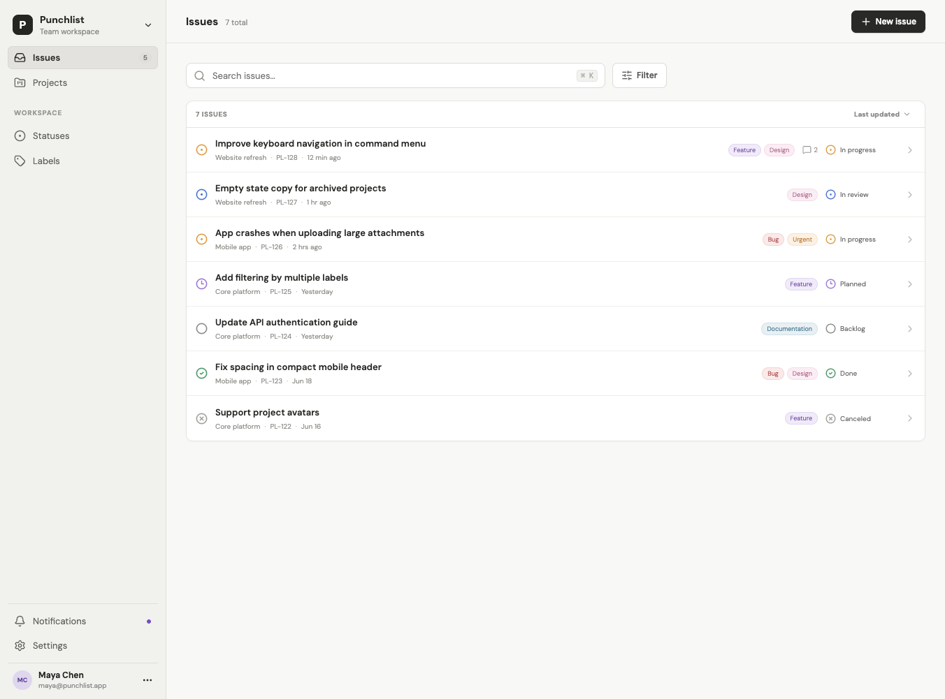
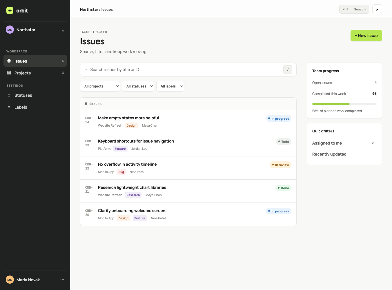
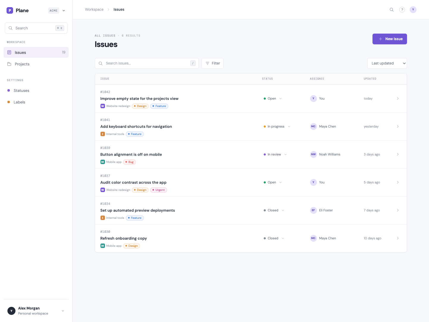
Low vs High
Here’s comparisons for Terra and Luna beteween Hihg and low effort
Terra: from straightforward list to richer workspace
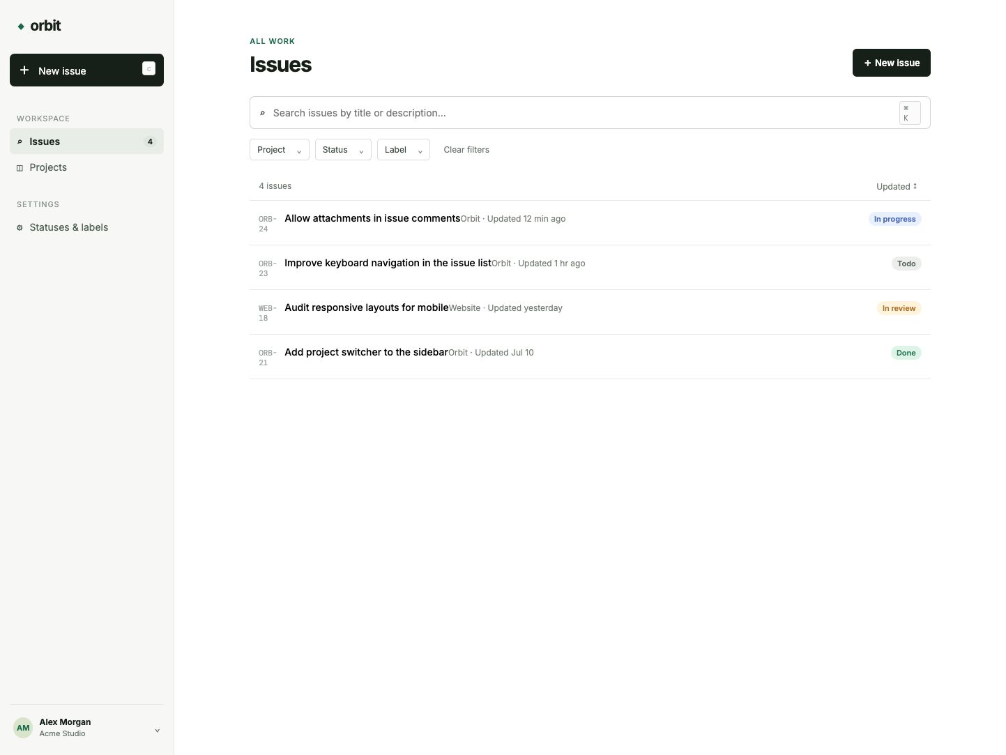
Luna: from a purple utility UI to a quieter product surface
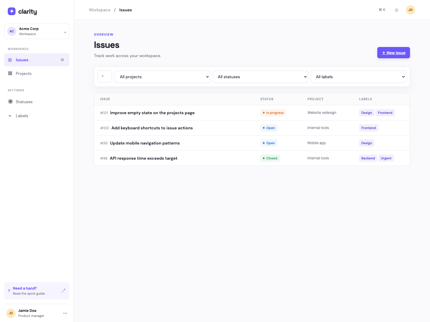
The important screens: creation, detail and administration
Creating an issue
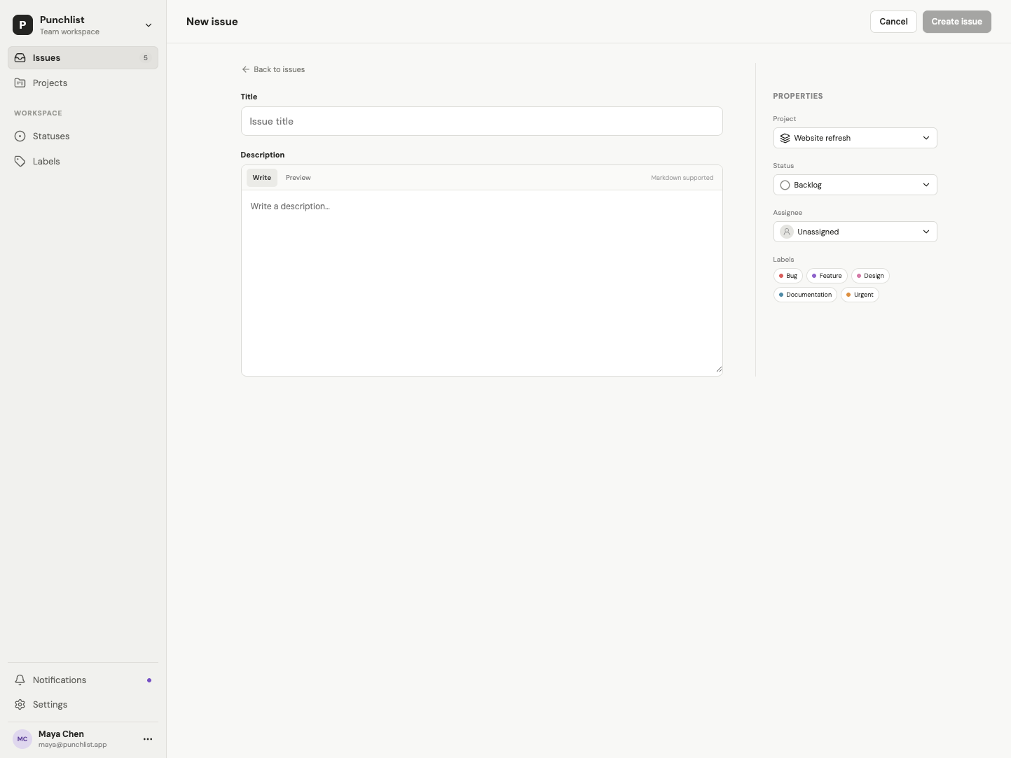
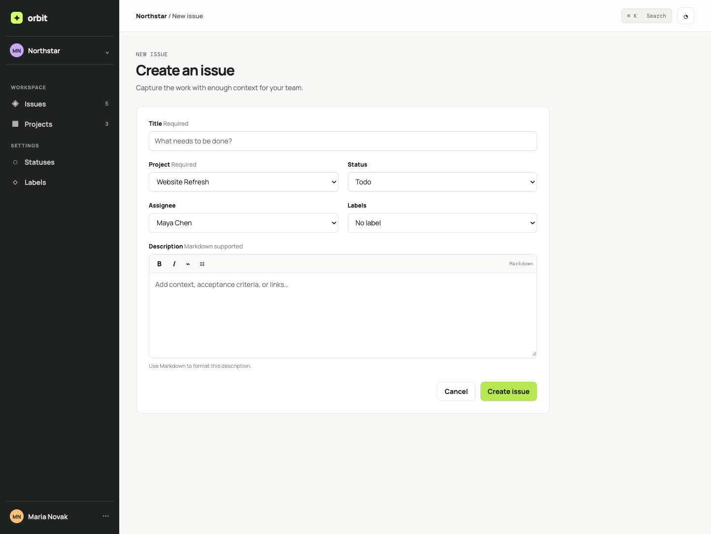
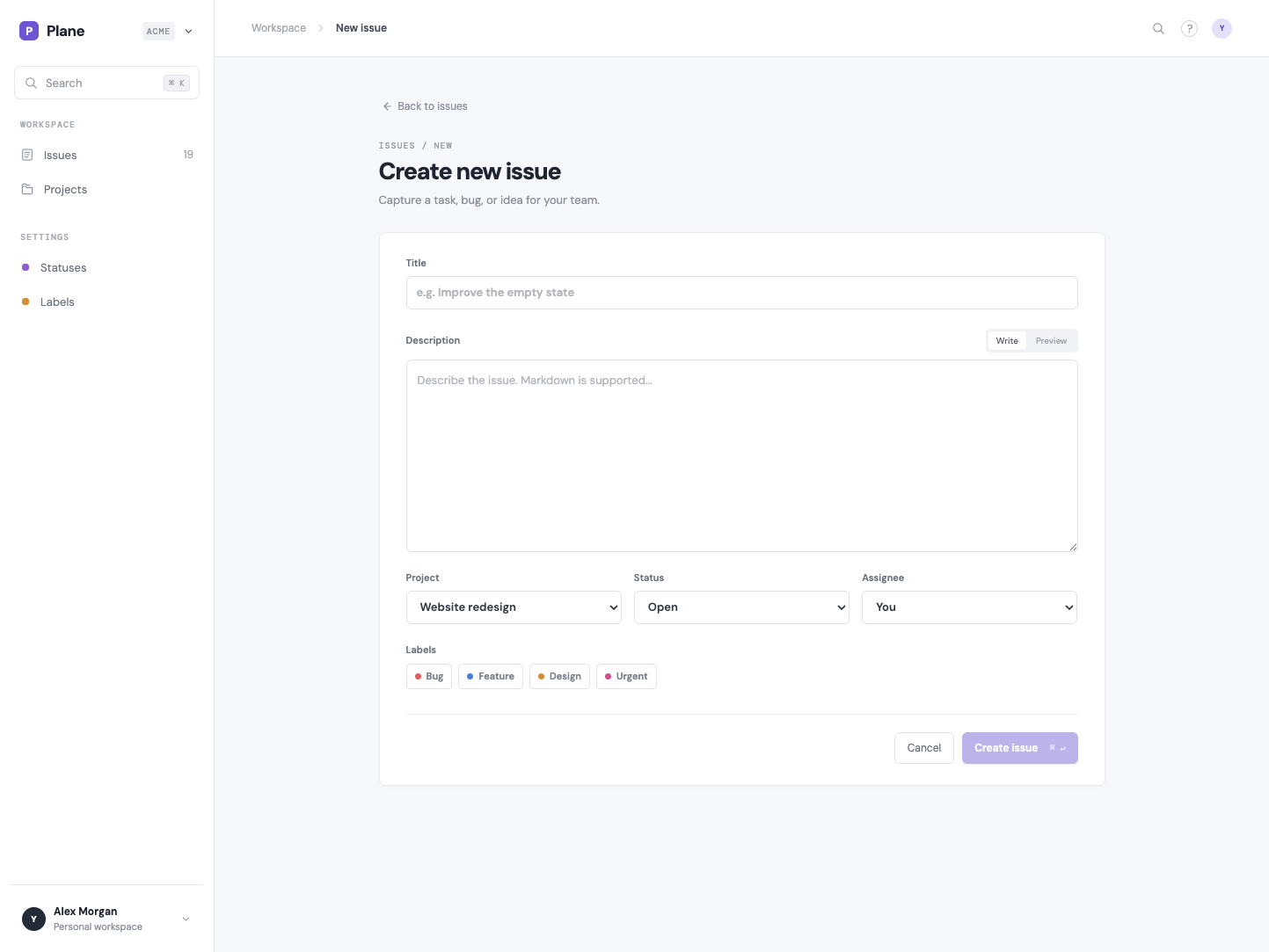
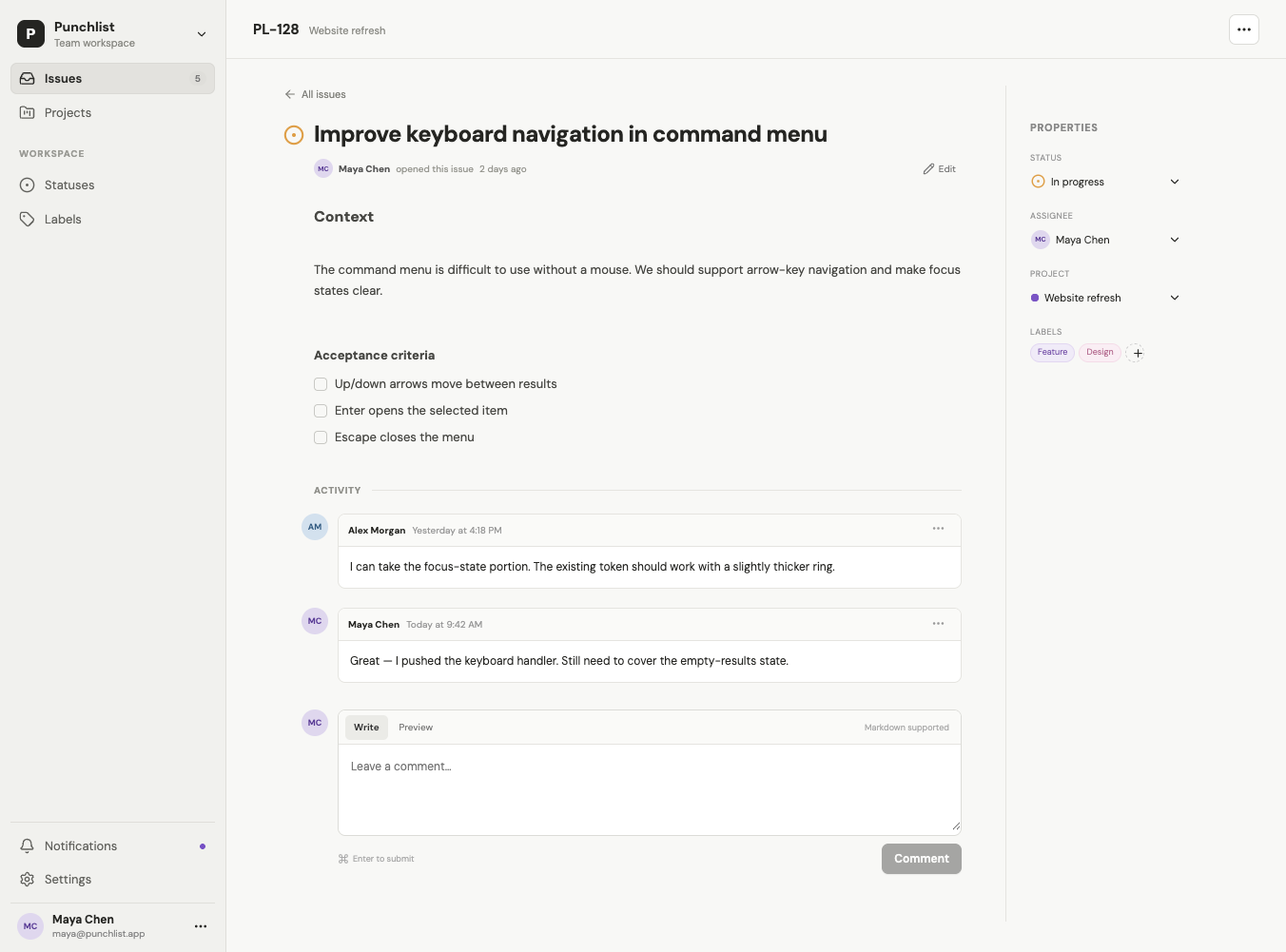
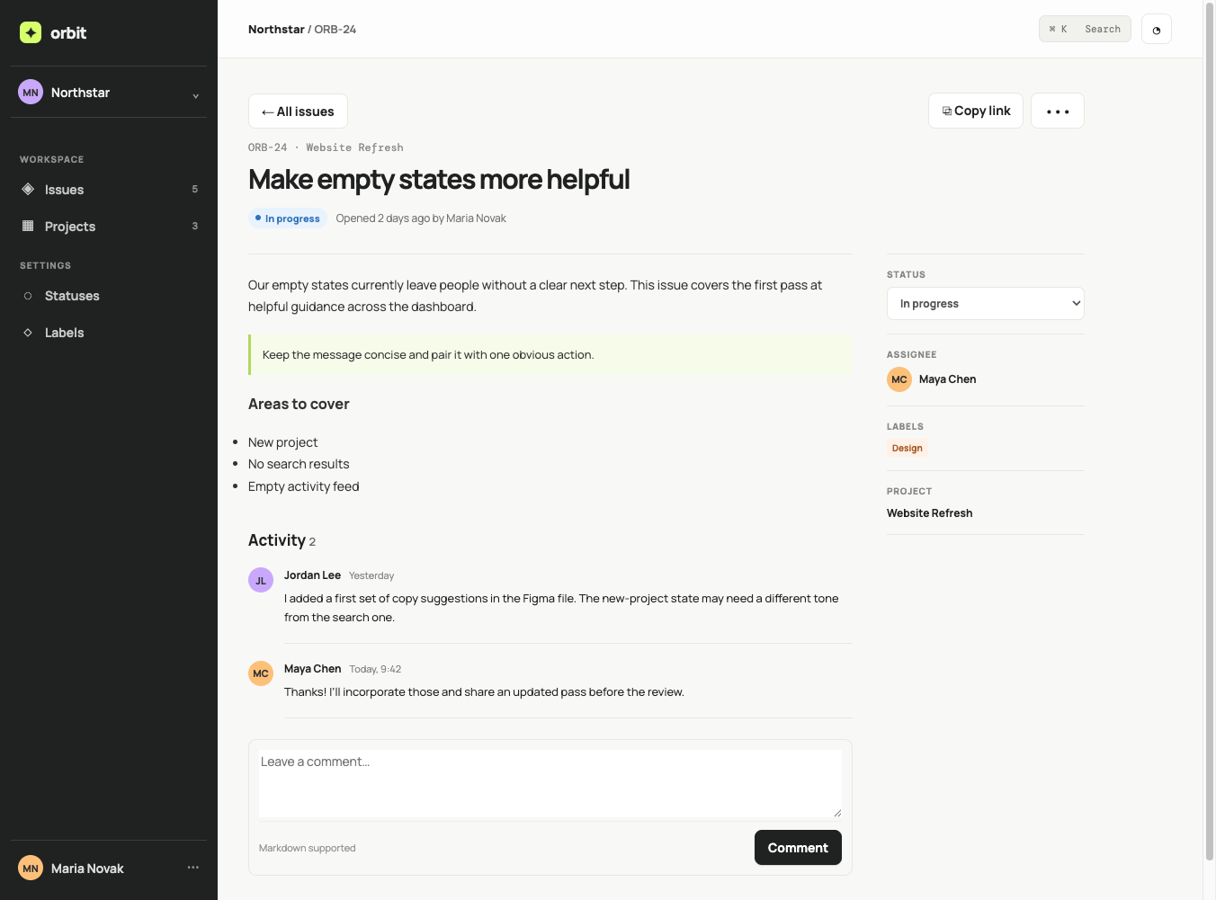
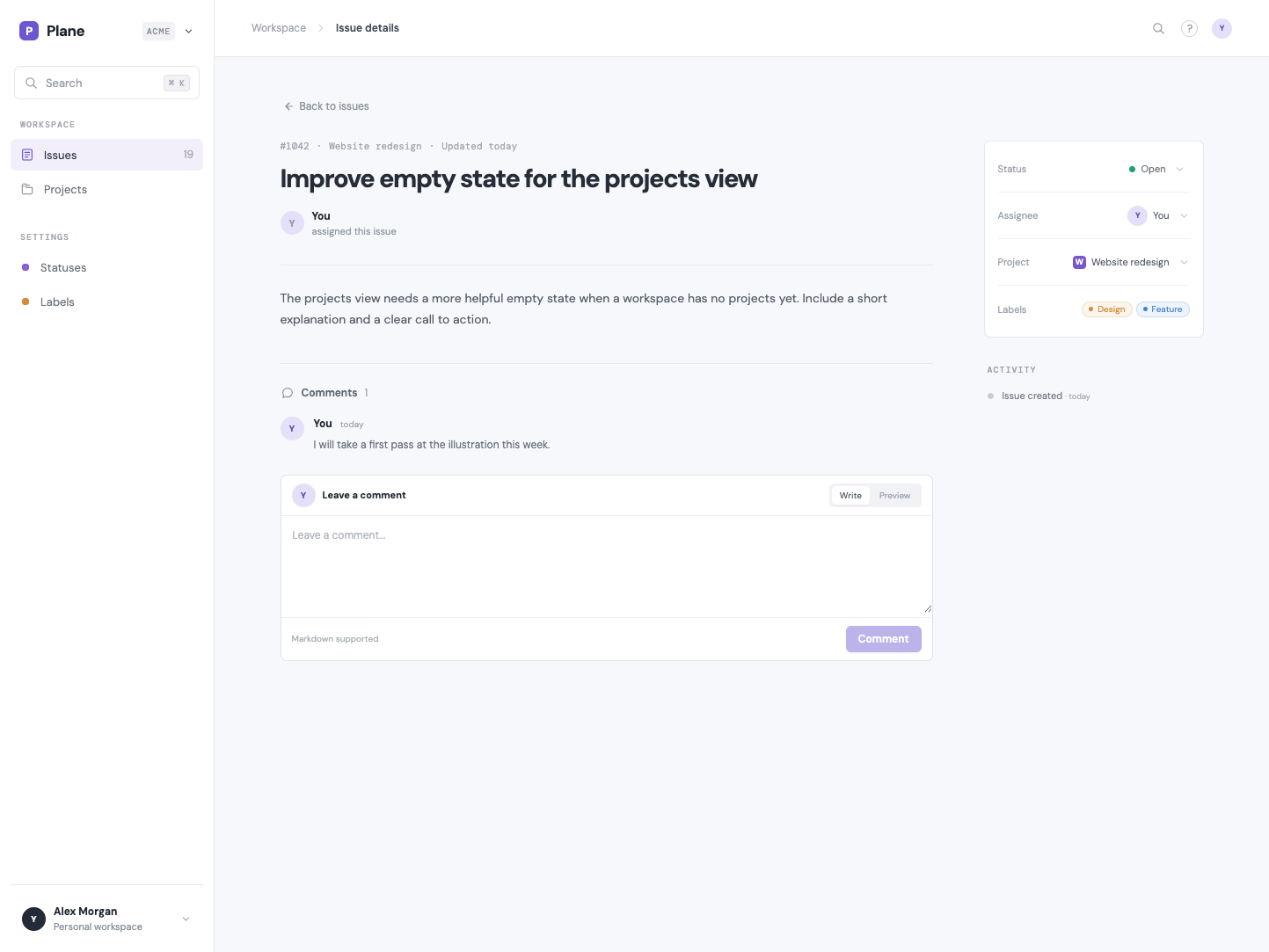
Reading an issue and adding a comment
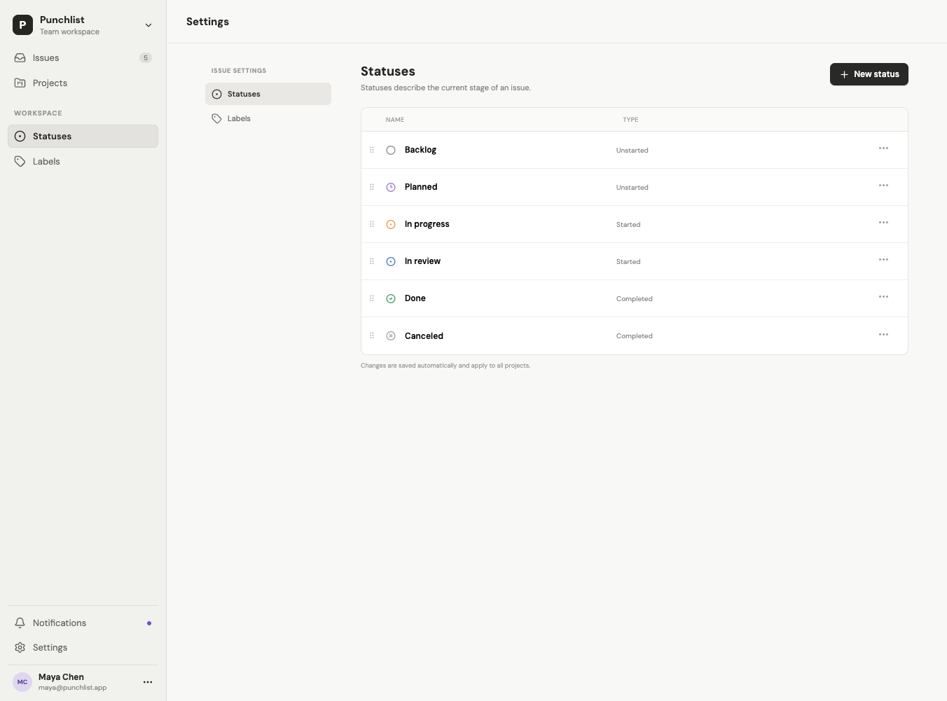
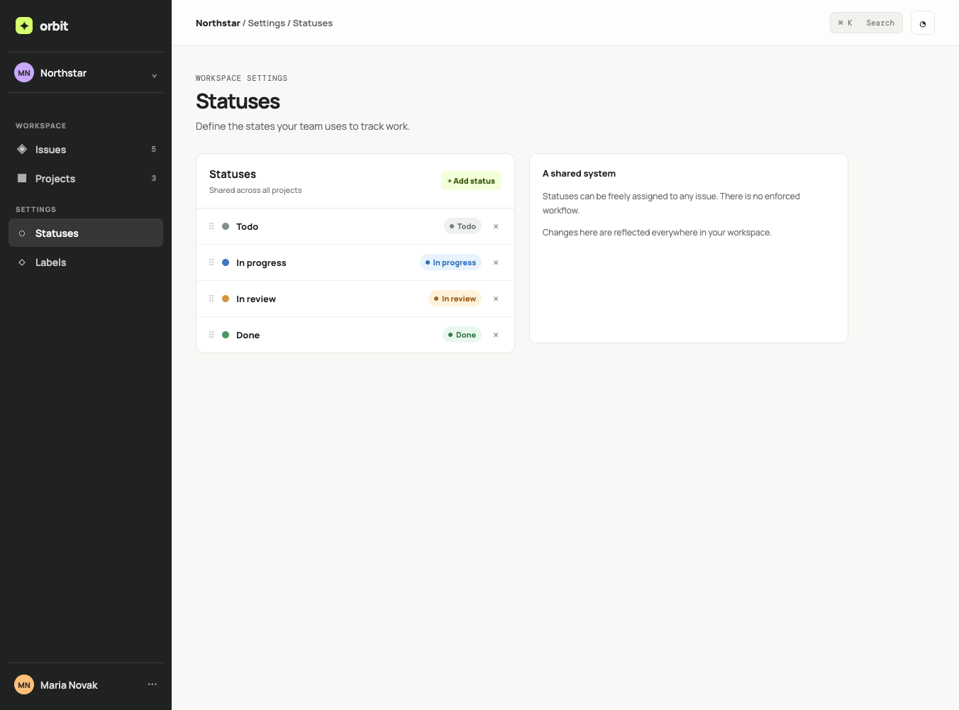
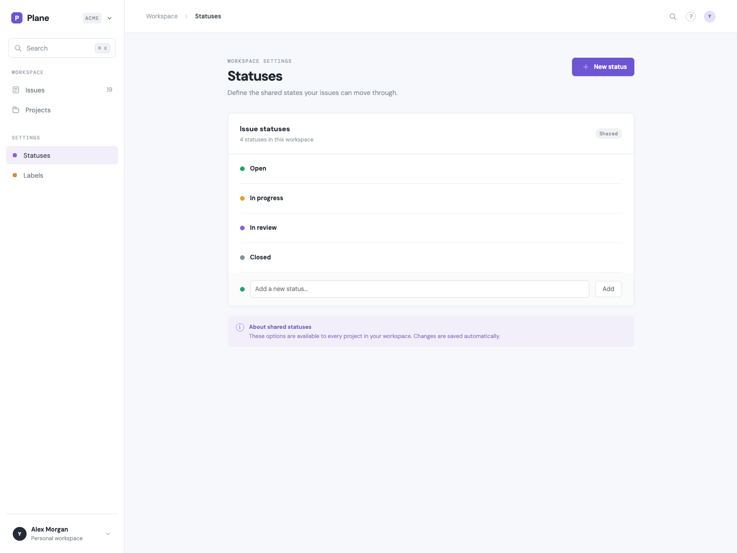
Status settings
Conclusions
Not much to say, on this level all look pretty neat. One small annoyance I had with 5.5 was that it really liked to put desciptions from the task into the UI. Like different kind of small descriptions about how the UI works. You can see example of that in Statuses view Terra created.